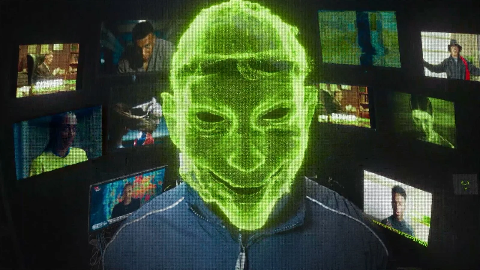
NIKE - SCARY GOOD

Nike / Wieden+Kennedy London / ProdCo
CREDIT: Additional Mask Design
It is important to say that the overall mask design preceded my involvement in this project, however, ProdCo sought to offer alternatives to the client that were less freaky - not scary - but designs that still incorporated the Nike logo.
Below are some alternatives that I devised for submission to the client.
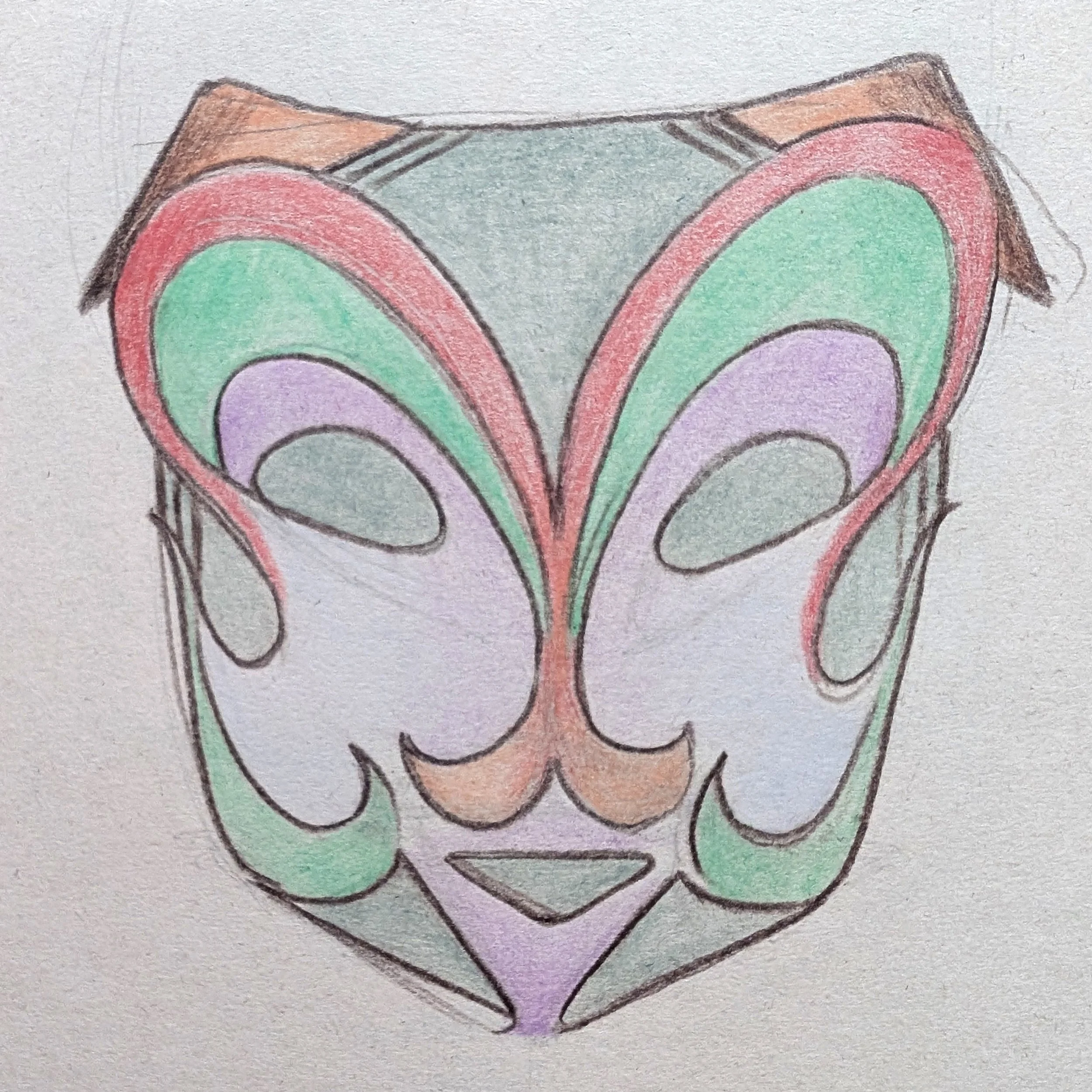
Mask #1
Option to retain the overall structure whilst softening the features and introducing more curves in line with the Nike brand “Swoosh”.
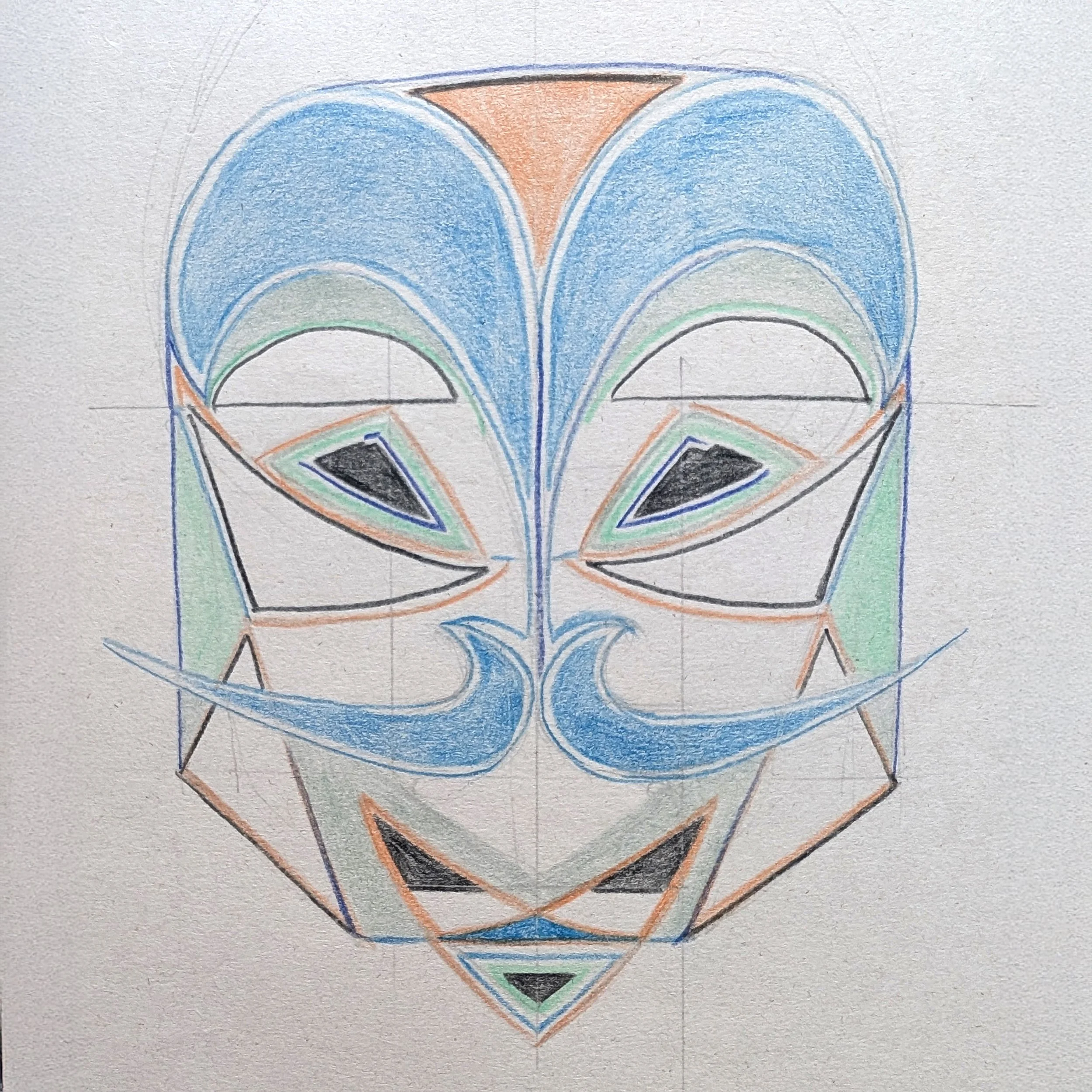
Mask #2
Looking towards traditional Japanese theatrical masks for inspiration. More formal with even greater emphasis on the Nike “Swoosh”.

Mask #3
The brief pointed towards trying to make the masks more playful and breaking up the hard lines of the mask outline (where it meets the face). I feel this one is a bit more French.